Designing an AI conversational tool for Australian suburb properties
I designed the whole thing from landing page, the chat interface, and the design system that holds them together. This case study follows one question through the product, screen by screen.
Outcome
PropSignal is Live and had further updates after the initial build.
Desktop prototype
Mobile prototype
What PropSignal does
The basic flow
The flow is short you ask, it pulls the relevant figures, and it replies. The walkthrough below steps through that, from the empty screen to the answer.

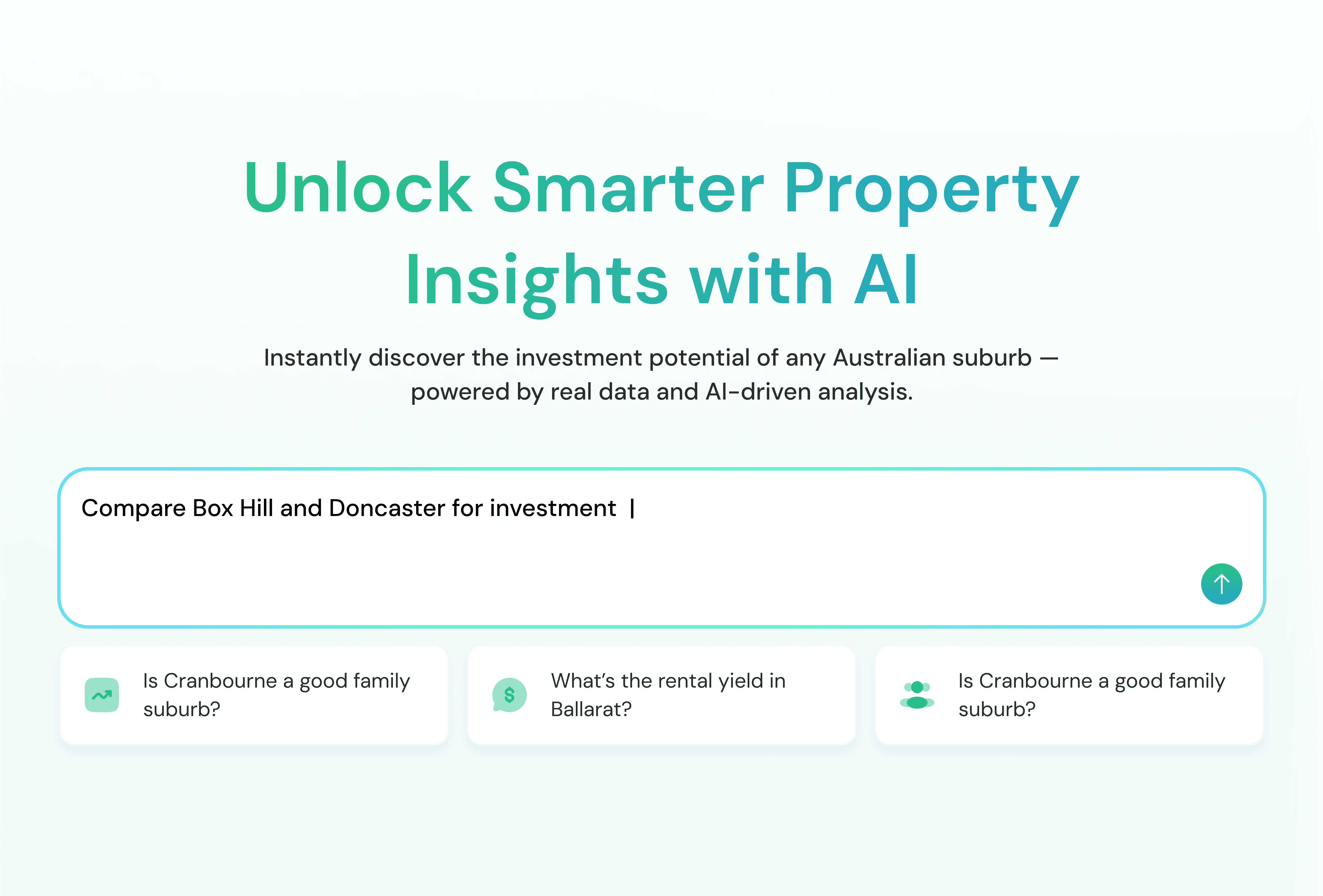


The entry point
The first screen has to show a stranger what to ask
We put three real questions right under the input to solve that. Each one runs if you tap it, and together they show the range of what PropSignal can answer. Further down the page, three short cards explain where the answers come from, because for a money decision the first thing anyone wonders is whether they can believe it.

Version 1
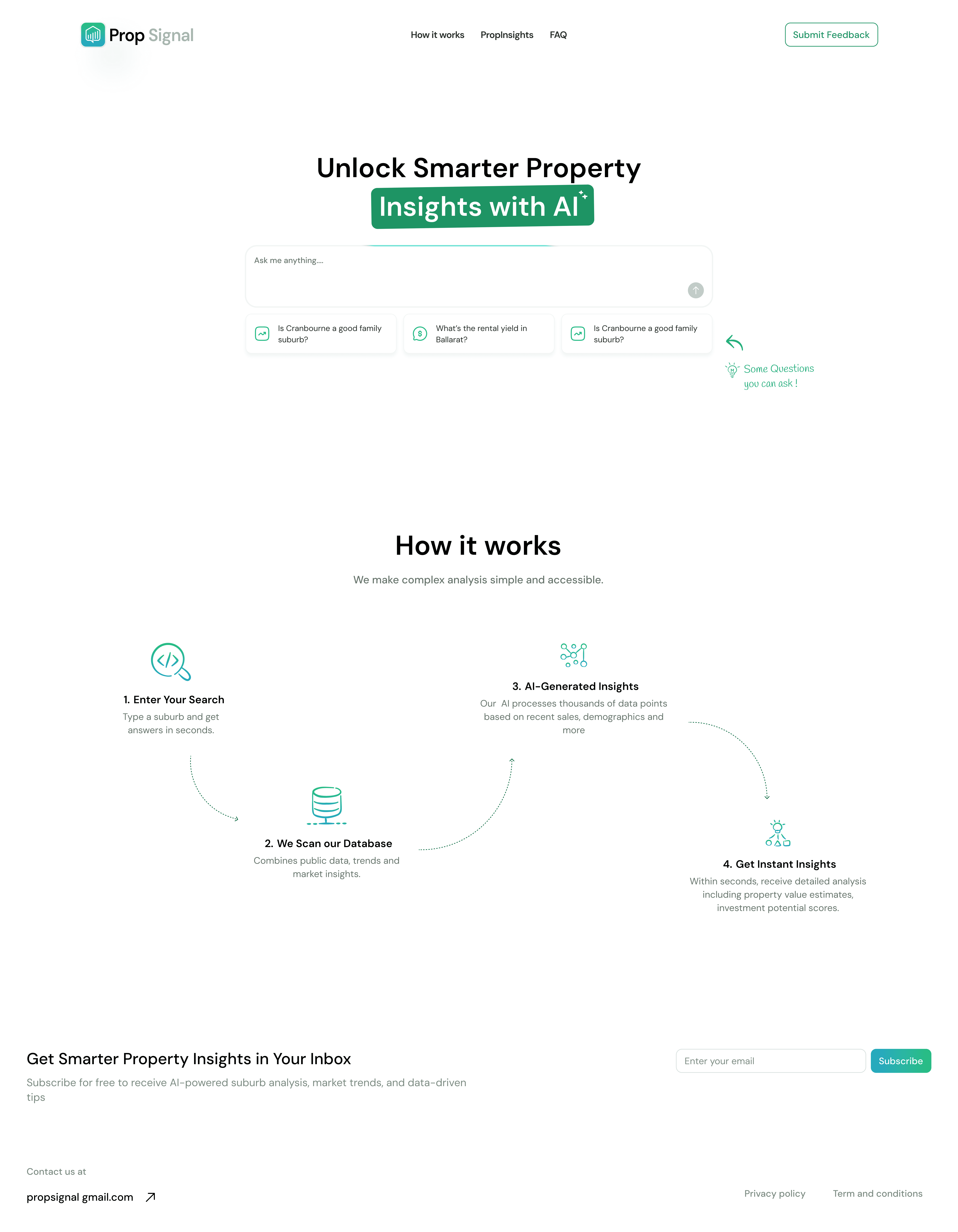
Version 2

Finalized version
The landing hero took two passes before it settled.
The answer
How the answer is put together
A long paragraph is hard to scan and hard to trust, so I structured the response instead of leaving it as prose. Click any part of the answer below to see how it is built.
Two smaller details round it out. While PropSignal works, it shows a short Analyzing state instead of a blank pause, and under every reply there is a row to copy the answer or mark it helpful, so someone can respond without typing a follow-up.
Design system
I built a design system to support our interfaces and have genuine scalability in mind
By the time I was drawing the fifteenth screen state, the thing keeping them consistent was the system underneath. Every colour, every text size, and the logo came from one place and got reused, so nothing drifted as the flow grew.



Reflection
What I took away from building it
With no precedent, you design the reasoning first
I couldn’t lean on an existing pattern, so every choice had to trace back to what the person was actually trying to work out. That made the screens easier to draw rather than harder.
The quiet states carried more than I expected
The loading label and the small feedback row were not an afterthought. They are the parts that make an AI answer feel accountable, and next time I would start with them instead of adding them at the end.
